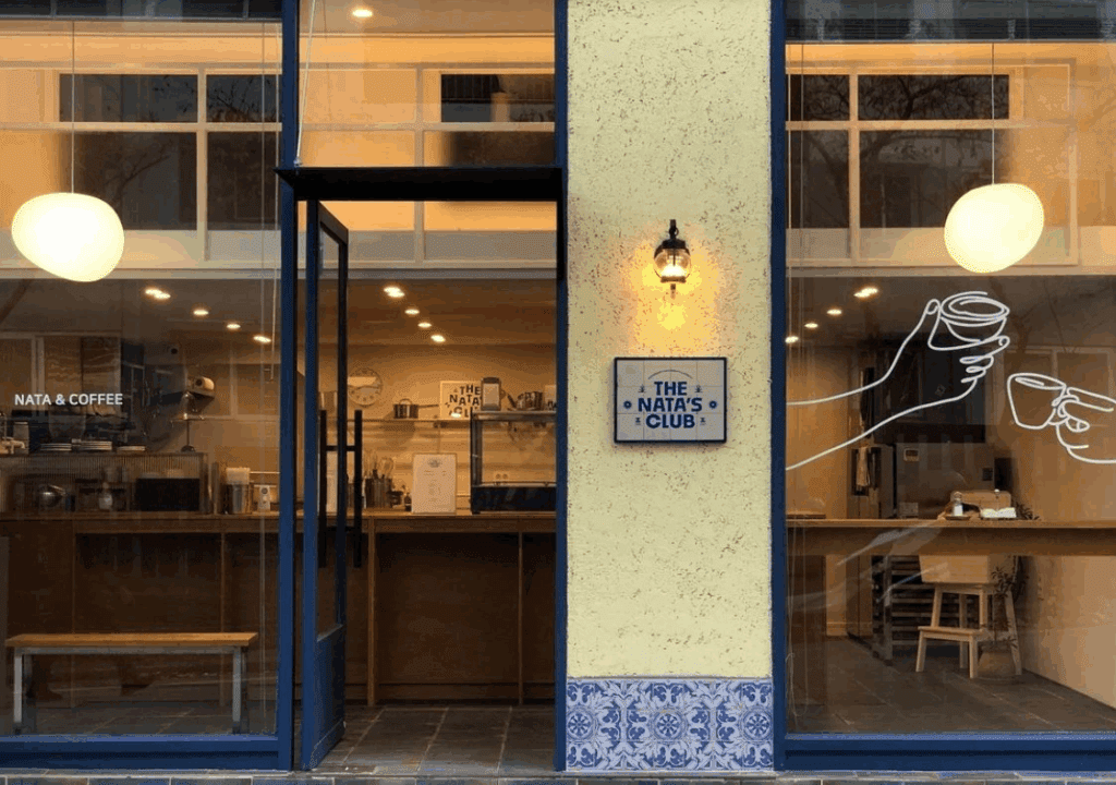
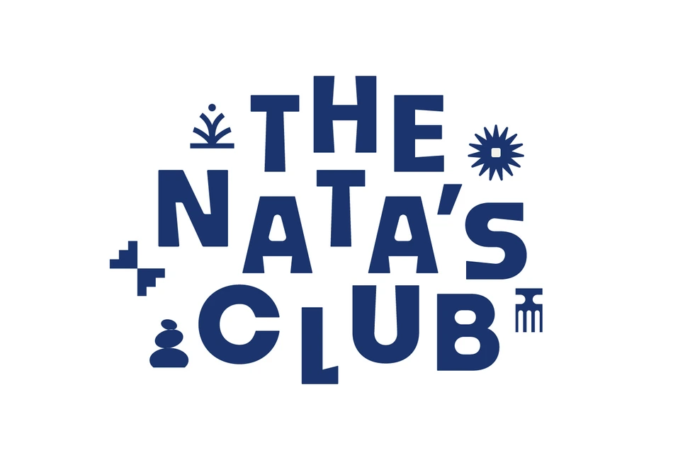
THE NATA’S CLUB
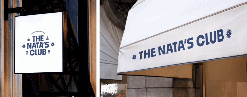
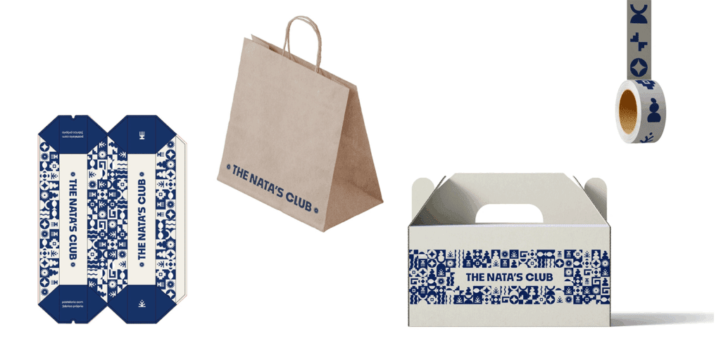
부산에 위치한, 포르투갈식 에그타르트를 굽는 스탠딩커피바 THE NATA’S CLUB의 BI 입니다.
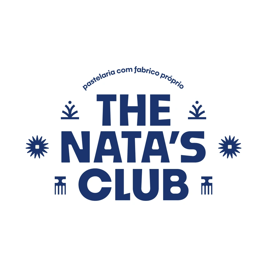
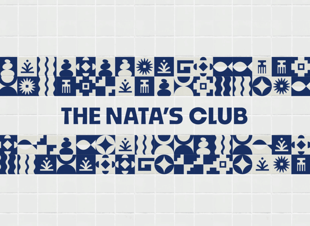
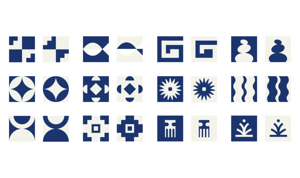
브랜드의 메인 비주얼은 포르투갈 특유의 감성이 느껴지는 ‘아줄레주(Azulejo)’에서 모티프를 얻어 다양한 심볼과 패턴우로 확장해 구성했습니다.
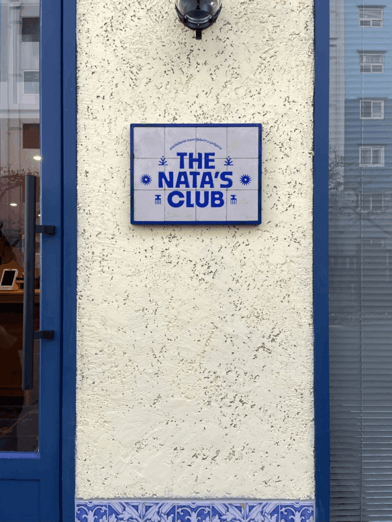
로고 타입은 직선과 곡선이 조화를 이루며 서체 굵기가 일정하지 않도록 구성했고, 주변에는 랜덤하게 배치된 심볼들로 자유로운 리듬감을 주었습니다.
좁은 골목 안 작은 스탠딩 바에서 동네 사람들이 잠깐 들러 커피와 타르트를 즐기며 수다를 떠는 모습이 떠올랐고, 그 장면에서 느껴지는 가벼운 율동감을 메인 로고에 담아냈습니다.
We designed the brand identity for THE NATA’S CLUB, a standing coffee bar in Busan specializing in Portuguese-style egg tarts.
The main visual concept draws inspiration from Azulejo, the traditional Portuguese ceramic tile, reinterpreted into a series of symbols and patterns that express the brand’s unique character.
The logotype blends straight and curved lines with intentionally uneven stroke weights, while surrounding symbols are placed randomly to evoke a sense of rhythm and playfulness.
We envisioned a small standing bar tucked away in a quiet alley — a place where locals casually stop by for coffee, egg tarts, and a quick chat. That light, rhythmic atmosphere inspired the overall feeling of the main logo.