Janus Deli
호주 골드코스트에 새롭게 오픈하는 델리 카페의 BI를 디자인했습니다.
이 공간은 가족적이고 편안한 로컬 분위기를 지향하며, 그에 맞는 컨셉을 전체 브랜딩에 반영했습니다.
전반적으로 화사하고 코지한 무드의 톤앤 매너를 사용하여 따뜻하고 친근한 인상을 전달하고자 했습니다.
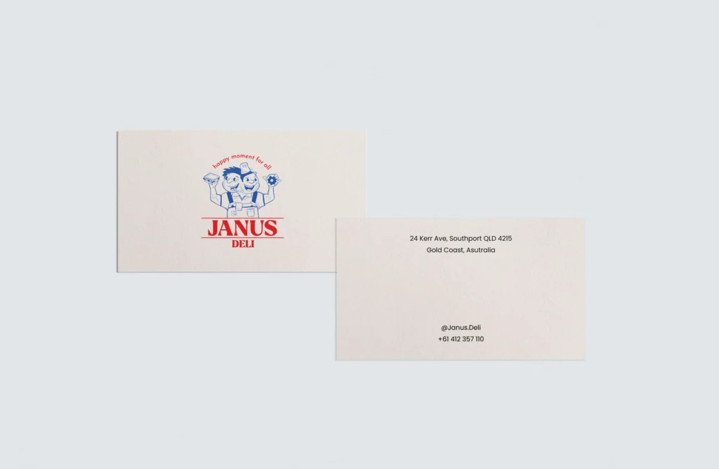
브랜드의 메인 로고는 두 사장님을 일러스트화한 캐릭터로 구성했습니다.
각각 도넛과 샌드위치를 들고 있으며, 신화 속 인물인 야누스(JANUS)처럼 하나의 몸에 두 개의 얼굴을 가진 형태로 표현했습니다.
이는 두 사람의 개성과 조화를 상징적으로 담아낸 요소입니다.
레드, 화이트, 블루 컬러를 메인 팔레트로 사용하여, 델리 특유의 정체성과 생동감을 강조했습니다.
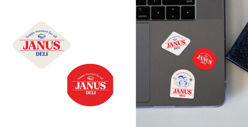
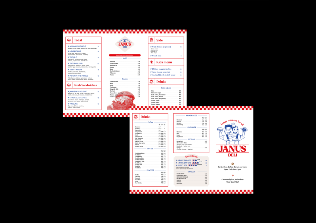
메인 캐릭터 로고 외에도 다양한 바리에이션을 개발하여, 인테리어부터 패키지, 굿즈, 온라인 채널까지 다양한 접점에서 활용할 수 있도록 확장성을 고려해 디자인했습니다.
We designed the brand identity (BI) for a new deli café opening in Gold Coast, Australia.
The space embraces a warm, family-friendly local vibe, and our concept reflects that atmosphere across the entire brand. We applied a bright and cozy tone and manner to convey a welcoming and approachable impression.
The main logo features an illustrated character inspired by the two owners of the café, each holding a donut and a sandwich — the café’s signature items. Taking inspiration from Janus, the Roman god with two faces, we created a character with one body and two faces, symbolizing their unique partnership and shared vision.
The core color palette includes red, white, and blue, evoking the classic deli identity while adding a fresh, energetic feel.
In addition to the main character logo, we developed a range of brand variations to ensure versatility across interior design, packaging, merchandise, and digital platforms.