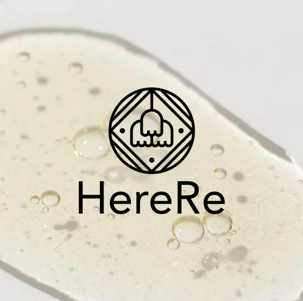
HereRe
비건 뷰티 브랜드 ‘히어리’의 로고 디자인을 맡았습니다.
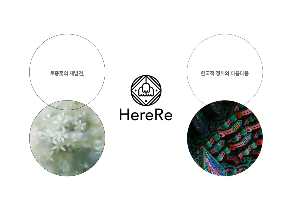
히어리는 한국의 토종 꽃에서 자연스럽고 편안한 향을 재발견하며, 핸드크림과 향수 같은 제품을 출시했습니다.
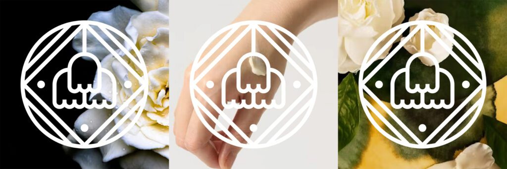
특히 다른 브랜드에서는 쉽게 만나기 어려운 ‘치자꽃’을 메인 소재로 제품을 개발했는데, 대표님은 로고에서도 이러한 향기가 느껴지길 원하셨습니다.
또한, 히어리는 한국 토종 꽃을 사용하는 비건 뷰티 브랜드인 만큼, 로고에 한국적인 요소를 담고 싶어했습니다.
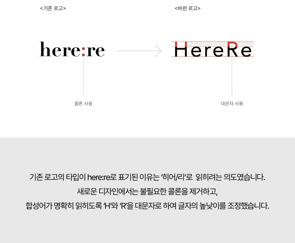
마지막으로, 브랜드 명인 ‘herere’가 ‘히어리’로 자연스럽게 읽히도록 의도했습니다.
미팅을 통해 도출된 디자인 키워드는 ‘재발견’, ‘향기’, 그리고 ‘한국적인 정취’였습니다. 이를 바탕으로 ‘꽃’과 ‘한국 전통 문양’을 모티프로 삼아 심볼을 디자인했고,
브랜드 네이밍이 더 명확하게 전달되도록 herere를 HereRe로 표기하여 완성했습니다.한글
I was in charge of designing the logo for the vegan beauty brand “HereRe“.
HereRe is a brand that rediscovered the natural and comforting scents of native Korean flowers, and launched products such as hand creams and perfumes.
Among them, the brand developed its products around the cape jasmine flower (치자꽃), a flower rarely found in other brands, and the CEO wished for the logo to evoke the unique fragrance of this flower.
As a vegan beauty brand that uses traditional Korean flowers, the CEO also wanted the logo to reflect a sense of Korean heritage.
Additionally, the brand name “herere” was intentionally designed to be naturally read as “히어리” in Korean.
From our meetings, the core design keywords were defined as “rediscovery,” “fragrance,” and “Korean sentiment.” Based on these, the symbol was created using motifs inspired by flowers and traditional Korean patterns.
To enhance the clarity of the brand name, we stylized it as “HereRe”, making the pronunciation more intuitive.