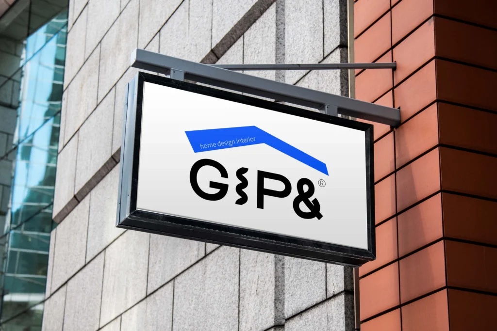
GIP&(집앤)
홈 디자인&인테리어 전문회사 GIP&(집앤)의 BI를 디자인했습니다.
집 하면 떠오르는 시각적 아이콘인 지붕을 활용해 심볼을 디자인했습니다.
이 심볼은 고객의 입장에서 다각도로 집을 연구하는 집앤의 아이덴티티를 나타냅니다.
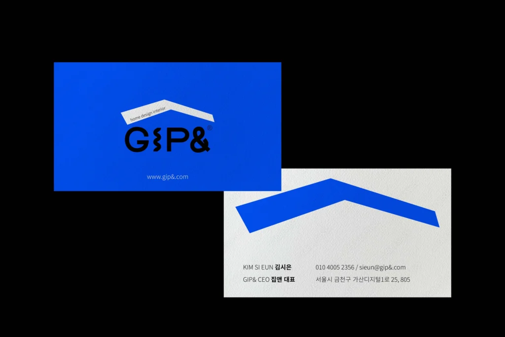
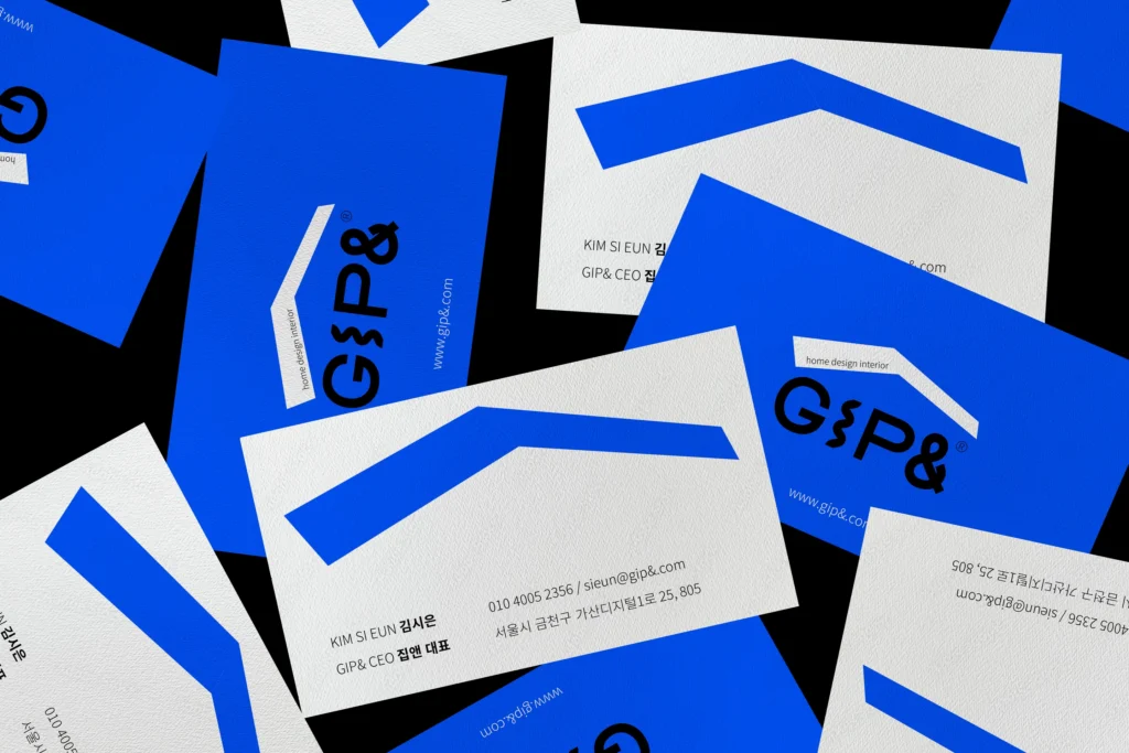
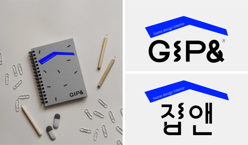
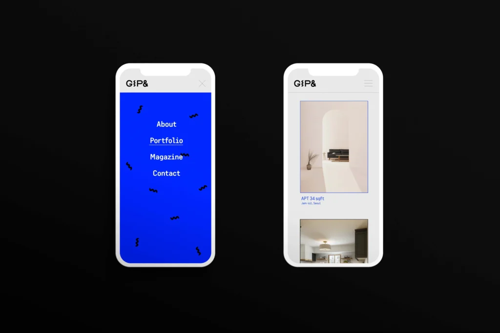
또한 타입로고에 있는 물결 그래픽으로 공간을 디자인 할 때의 설렘을 표현하고자 했습니다. 이 물결 그래픽은 서브 그래픽 모티브로써 패턴 디자인 등에 활용이 가능합니다.
밝은 블루를 메인 컬러로 지정했으며, 즐겁고 경쾌한 집을 함께 만들고자 하는 철학을 시각적으로 함축하여 완성했습니다.
We designed the brand identity (BI) for GIP& (집앤), a company specializing in home design and interior solutions.
The symbol is based on the roof—a visual icon that instantly evokes the image of a house.
This represents GIP&’s identity of exploring the concept of “home” from multiple angles from the customer’s perspective.
The type logo includes a wave graphic, which symbolizes the excitement and anticipation that come with designing a space. This wave graphic also serves as a sub-graphic motif and can be applied to patterns and other design elements.
A bright blue was chosen as the main color to visually convey the joyful and lively philosophy of building happy homes together.