DAY PREP
Day Prep의 브랜드 아이덴티티를 디자인했습니다.
Day Prep은 미국 아이비리그 진학에 특화된 에듀 컨설턴트그룹입니다.
브랜드는 전문가들만이 알 수 있는 아이의 재능을 파악하여 본인의 잠재력을 읽고 학생만의 개별화된 스토리를 도 출해 냅니다.
따라서 1:1 맞춤 컨설팅만의 하이엔드를 추구하면서도 합격과 미래를 떠올릴 수 있는 밝고 선명한 분위기를 만들고자 했습니다.
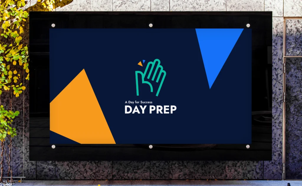
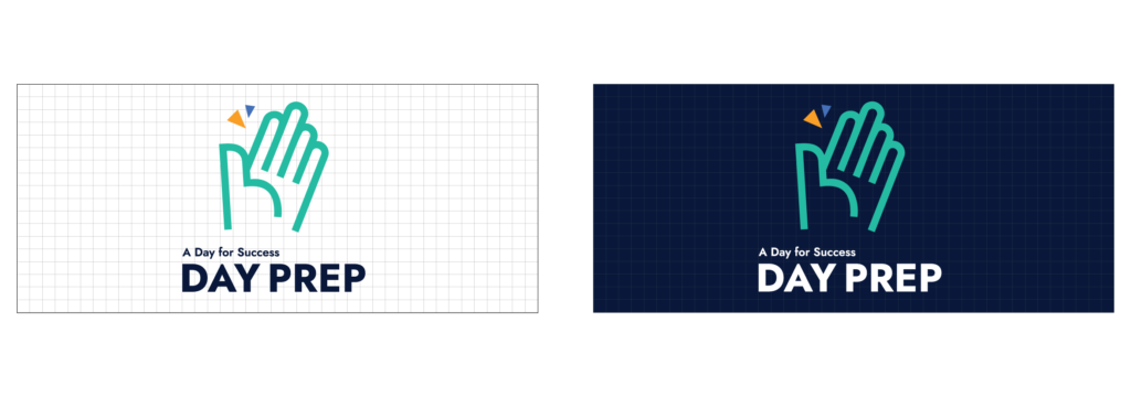
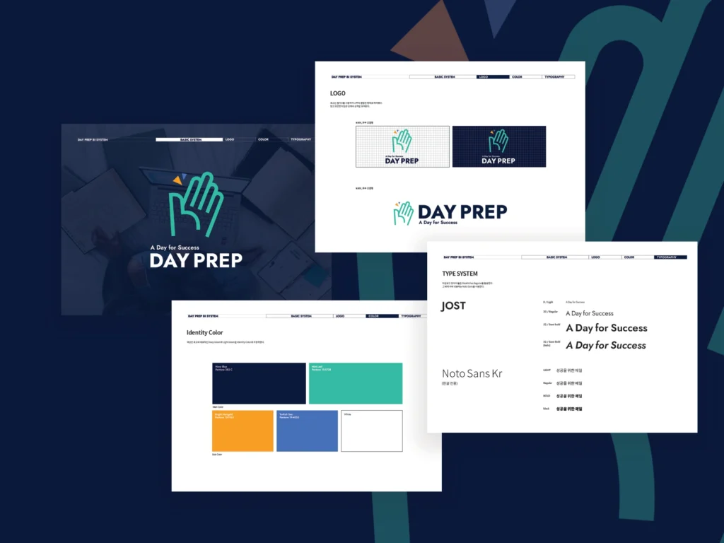
Prep은 prepare의 약자인데, ‘준비하는 오늘, 성공적인 내일과의 하이파이브’라는 캐치프레이즈를 의미하고있습니다.
이 캐치프레이즈를 시각적으로 표현하기 위해 하이파이브의 손과, 하이파이브를 할 때에 나는 소리를 시각적으로 표현해 심볼을 제작했습니다.
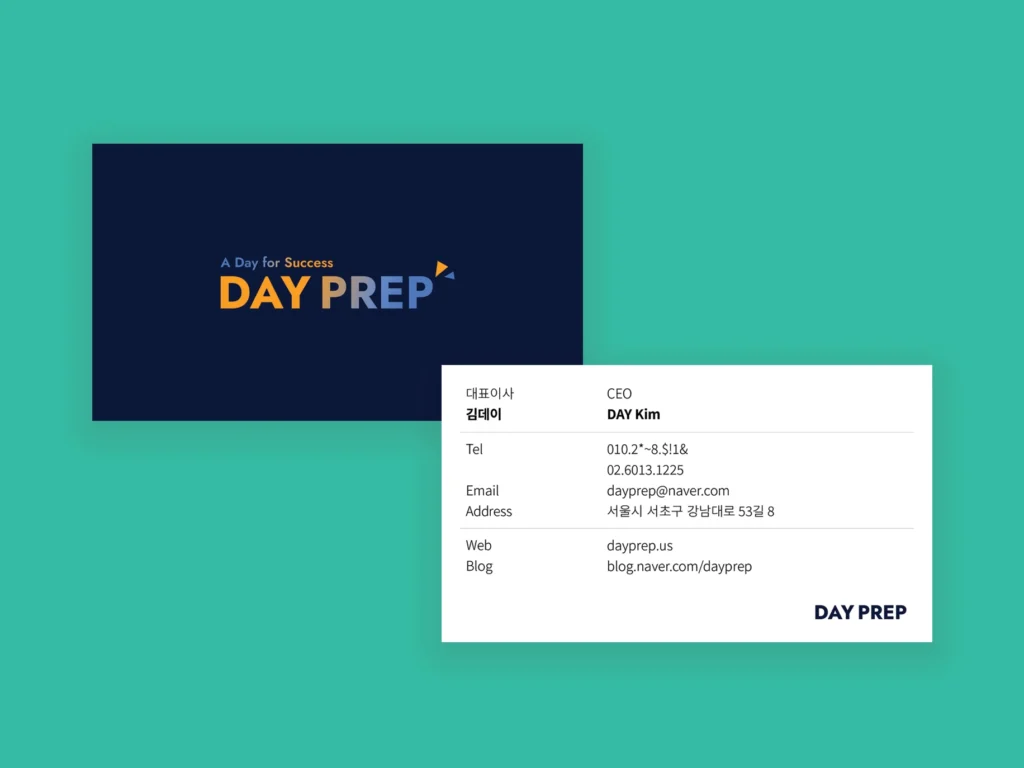
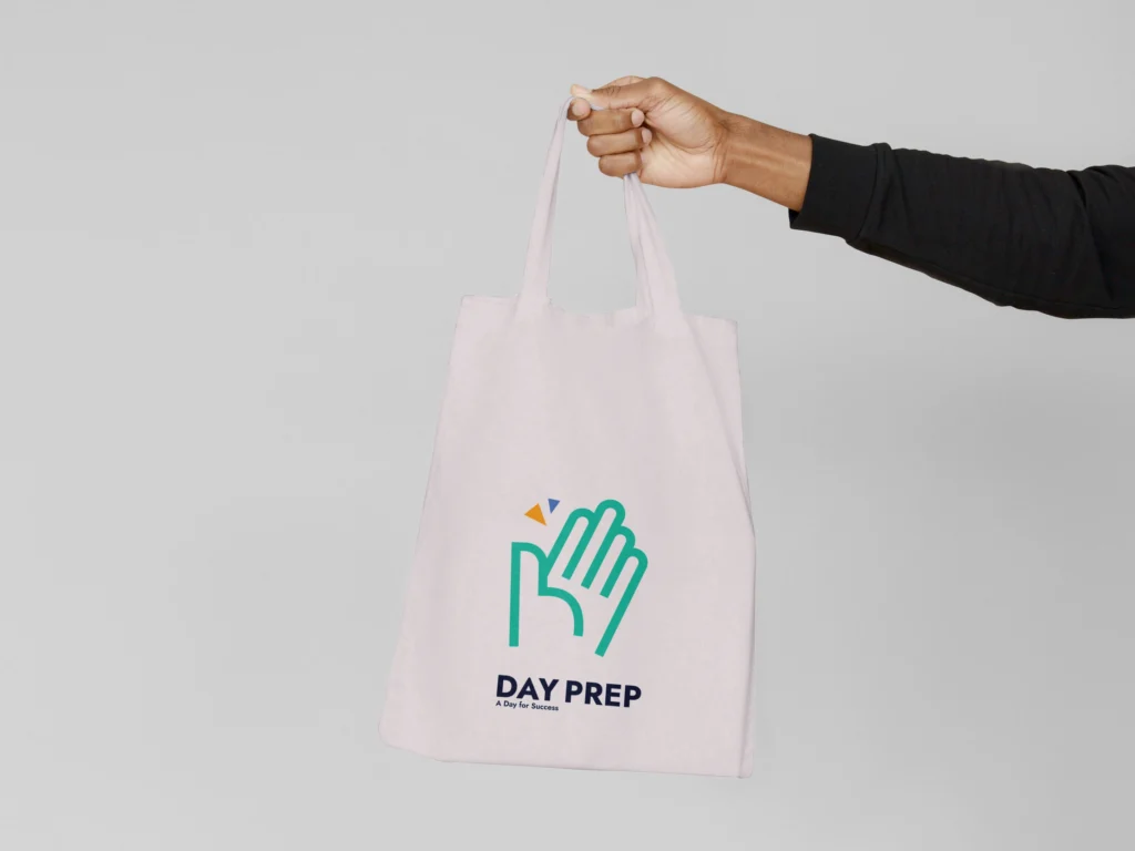
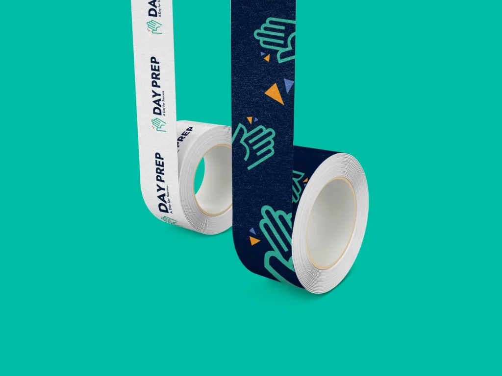
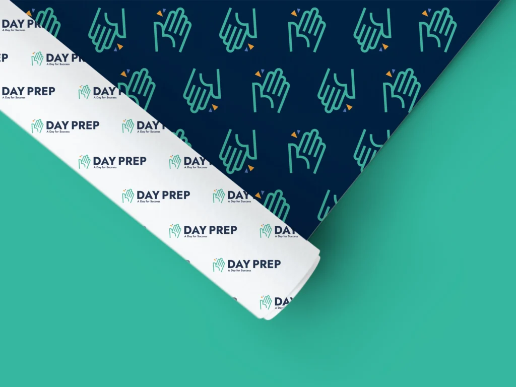
메인컬러는 네이비이며 서브로 옐로우와 그린, 블루를 사용했습니다. 심볼에 들어간 삼각형을 그래픽으로 활용해 크기를 키우거나 패턴으로 만들 수 있습니다. 그밖에도 BI를 명함이나 에코백, 스티커 등에 활용하였습니다.
가독성이 높은 영문 폰트 Jost와 한글 폰트는 Noto sans kr를 함께
사용했습니다.
I designed the brand identity for Day Prep.
Day Prep is an education consultancy group specialized in Ivy League admissions in the United States.
The brand focuses on identifying a child’s talents—known only to experts—to unlock their potential and develop a personalized story unique to each student.
Therefore, while pursuing a high-end, one-on-one customized consulting approach, we aimed to create a bright and clear atmosphere that evokes both acceptance and the future.
“Prep” is short for “prepare,” with the catchphrase “Preparing today, high-fiving a successful tomorrow.”
To visually express this catchphrase, we created a symbol featuring a high-five hand and a graphic representation of the sound made during a high-five.
The main color is navy, with yellow, green, and blue as secondary colors. The triangles incorporated into the symbol are used as graphic elements that can be scaled or patterned.
Additionally, the BI is applied to business cards, eco bags, stickers, and more. For typography, we used the highly legible English font Jost alongside the Korean font Noto Sans KR.