DAMDA FRUITS
담다는 군산에서 생긴 프리미엄 과일 브랜드입니다.
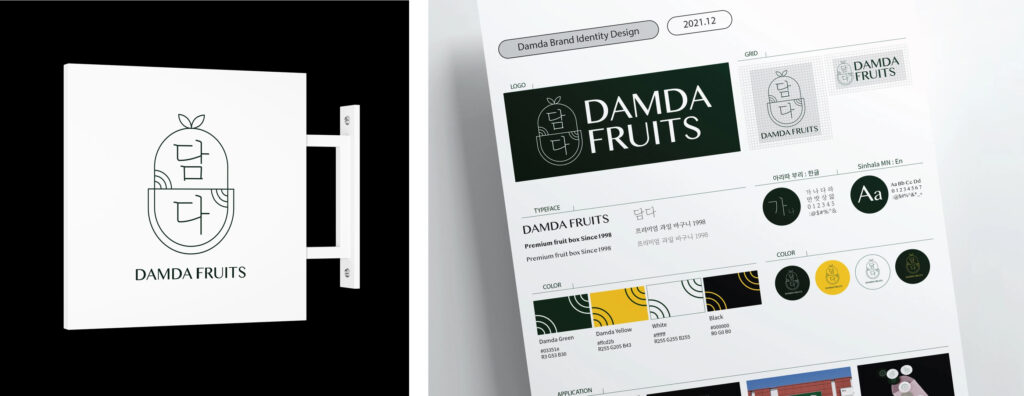
소중하고 귀한 사람에게 선물하는 프리미엄 과일이라는 브랜드 컨셉을 전달하기 위해 정성스럽게 싼 보자기 포장 모티프를 이용해 BI를 제작했습니다.
명절을 주력하는 상품인 만큼 한국적인 분위기를 담아 얇은 선으로 전통 문양을 표현했습니다.
또 그런 심볼과 대조되는 영문 폰트 Shinhala MN을 사용해 현대적인 느낌을 더했습니다.
짙은 그린으로 고급스럽고 차분한 이미지를 갖고 있습니다.
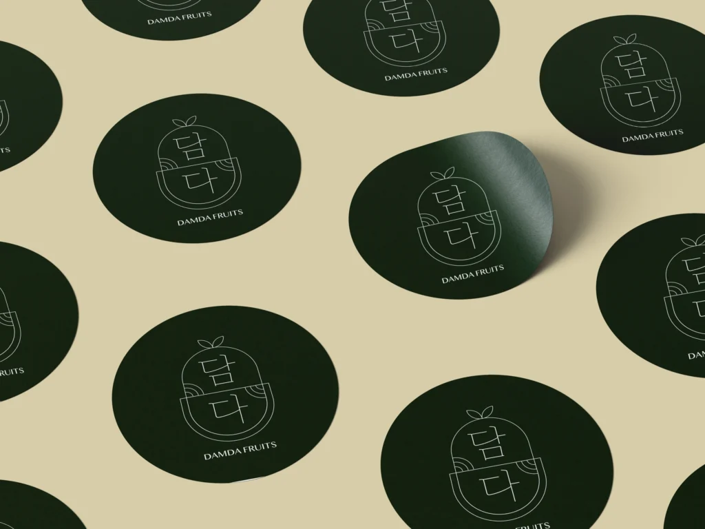
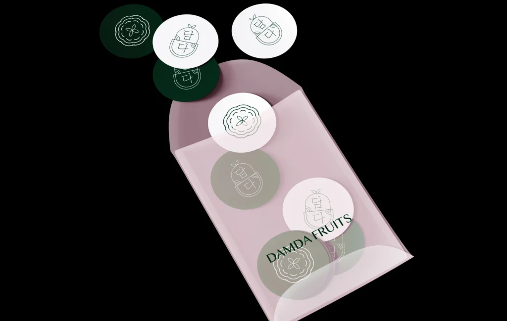
과일들에 붙일 스티커 네 종을 제작했고 해당 스티커가 붙어있는 신선한 과일을 보여주는 광고 이미지도 제작했습니다.
Damda is a premium fruit brand originating from Gunsan.
To convey the brand concept of premium fruit as a gift for precious and valued people, we created the brand identity (BI) using a motif inspired by carefully wrapped bojagi (traditional Korean wrapping cloth).
Since the brand focuses mainly on holiday gift products, we incorporated a Korean atmosphere by expressing traditional patterns with delicate thin lines.
To contrast with the traditional symbol, we used the modern-looking English font Shinhala MN to add a contemporary touch.
The deep green color gives the brand a sophisticated and calm image.
We also designed four types of stickers to be attached to the fruits, and produced advertising images showcasing fresh fruits with these stickers.