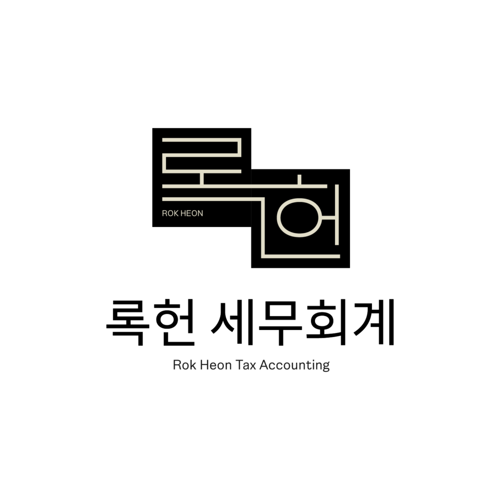
록헌 세무회계
록헌 세무회계의 로고를 제작했습니다.
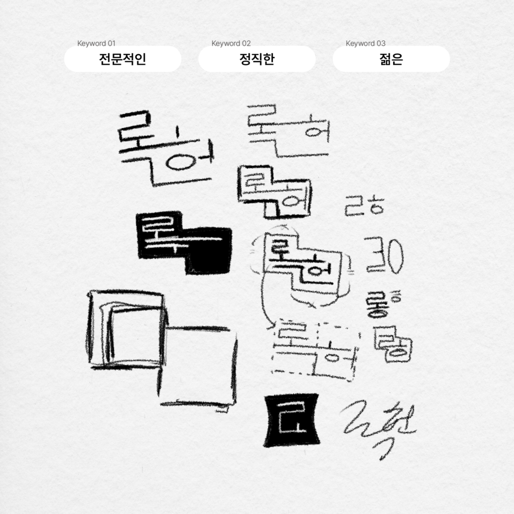
‘록헌’이라는 이름을 로고화 하고 싶어 하는 클라이언트의 요구에 맞춰 디자인 했습니다.
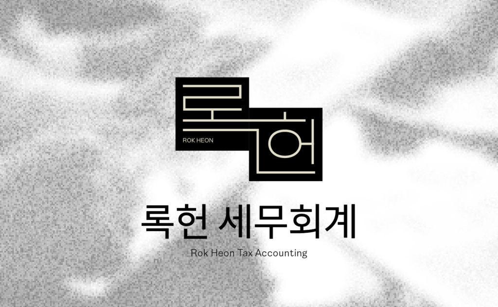
로고는 정직하고 전문적인 분위기로 도장이 연상되는 사각 형태로 만들었습니다.
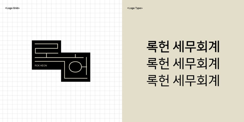
그리고 두 글자의 마지막 자음 두 개가 이어지도록 그린 후 이 형태를 모두 감싸는 계단 형태의 심볼을 완성했습니다.
이 형태는 좀 더 기억에 남는 인상을 줄 수 있습니다.
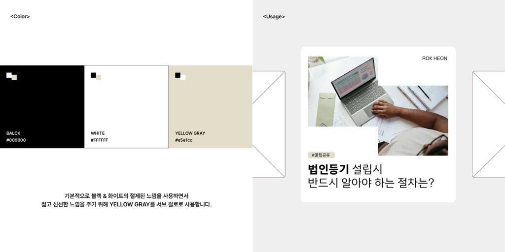
해당 직종에서 많이 보이는 푸른 계열의 팔레트를 탈피하되 가볍지 않은 느낌을 주고 싶어 차분한 옐로우 그레이 계열을 사용했습니다.
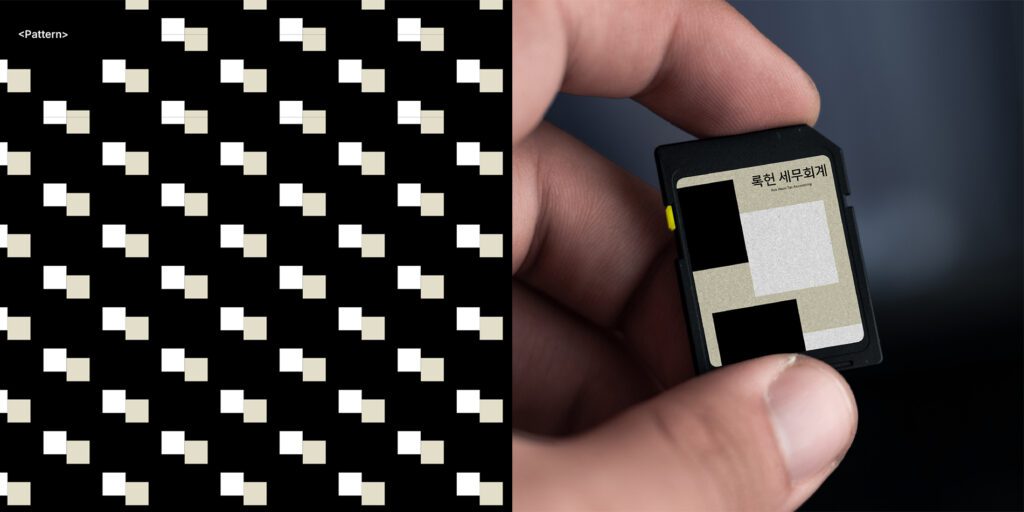
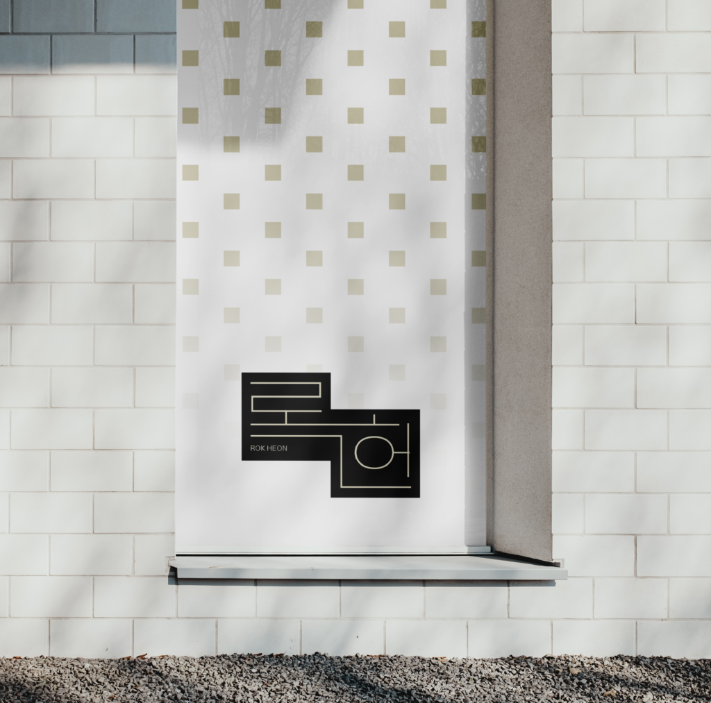
배경의 심볼은 바리에이션 하여 패턴으로 사용할 수 있습니다.
I designed the logo for Rokheon Tax & Accounting.
The client wanted the name “Rokheon” itself to be visualized as the logo, so I designed it accordingly.
The logo was created in a square shape reminiscent of a stamp, to convey a sense of honesty and professionalism.
I connected the final consonants of the two Korean characters and built a stair-like symbol that surrounds the entire shape.
This form creates a more memorable impression.
Instead of the common blue-toned palette often seen in this field, I chose a subtle yellow-grey tone to avoid a lightweight feel while maintaining calmness.
The background symbol can be varied and used as a repeating pattern.