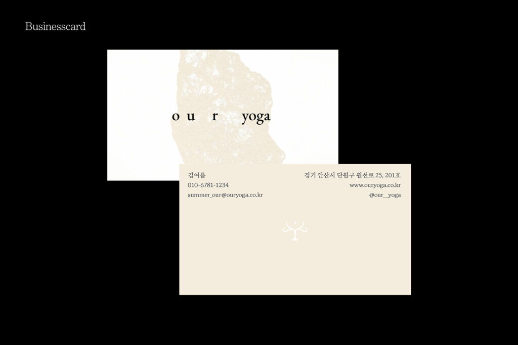
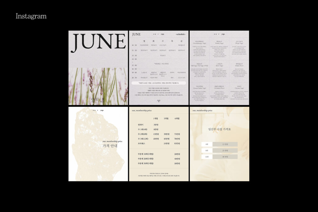
our yoga
our yoga
BI Renewal
2025.05
요가 스튜디오 리브랜딩 프로젝트를 소개합니다.
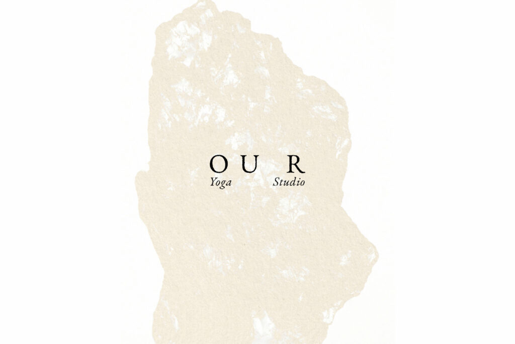
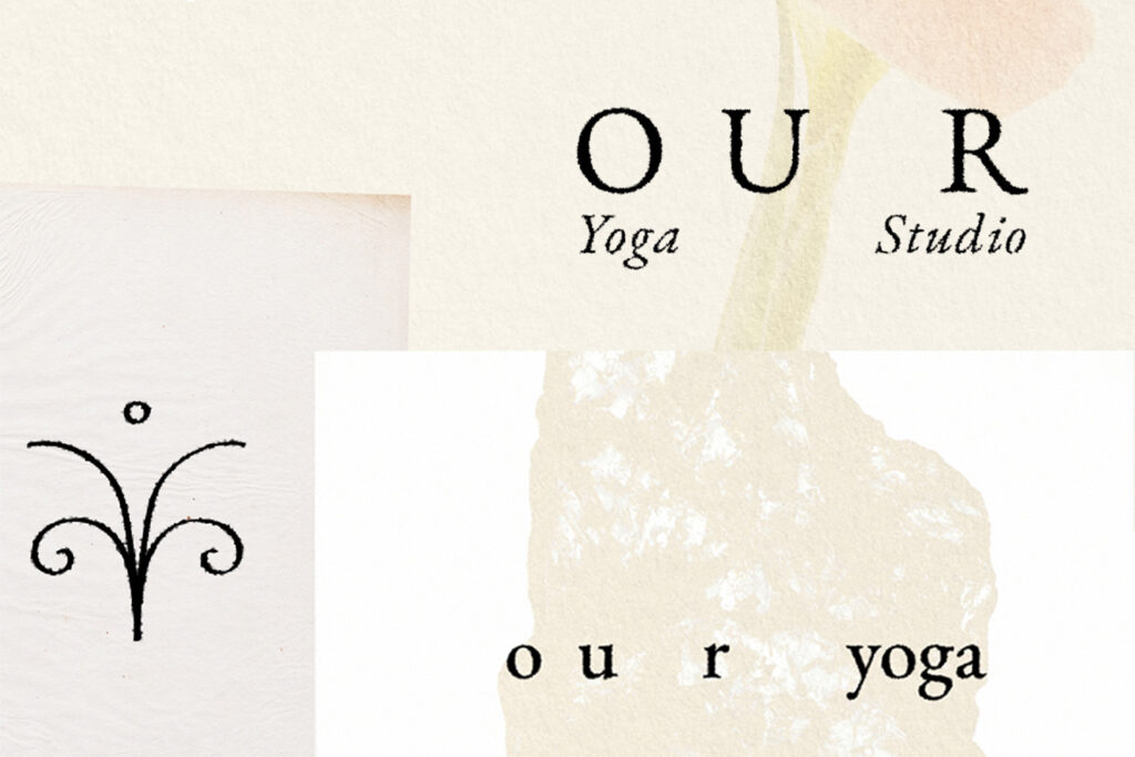
스튜디오 이름 OUR에는 이곳을 찾는 사람들이 함께 수련하며 편안함과 결속감을 느낄 수 있기를 바라는 마음을 담았습니다.
브랜드 비주얼은 요란함을 덜어내고, 차분함 속에서 집중할 수 있도록 구성했습니다. 로고 역시 불필요한 장식을 모두 배제하고, 간결한 글자 형태로만 완성해 스튜디오의 정성과 분위기를 담아냈습니다.
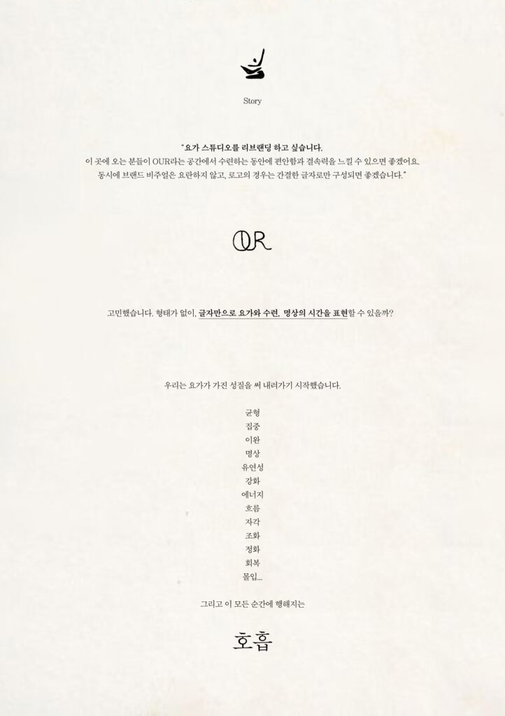
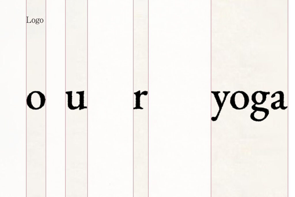
이번 리브랜딩의 핵심은 글자와 글자 사이의 공간을 브랜드의 아이덴티티로 표현했다는 점입니다. “형태 없이, 글자만으로 요가와 수련, 명상의 시간을 드러낼 수 있을까?”라는 질문에서 출발해, 우리는 요가가 가진 본질적인 성질을 하나씩 써 내려갔습니다.
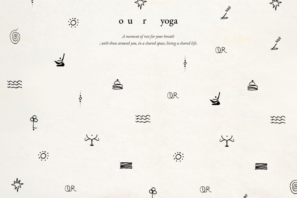
균형, 집중, 이완, 명상, 유연성, 강화, 에너지, 흐름, 자각, 조화, 정화, 회복, 몰입…
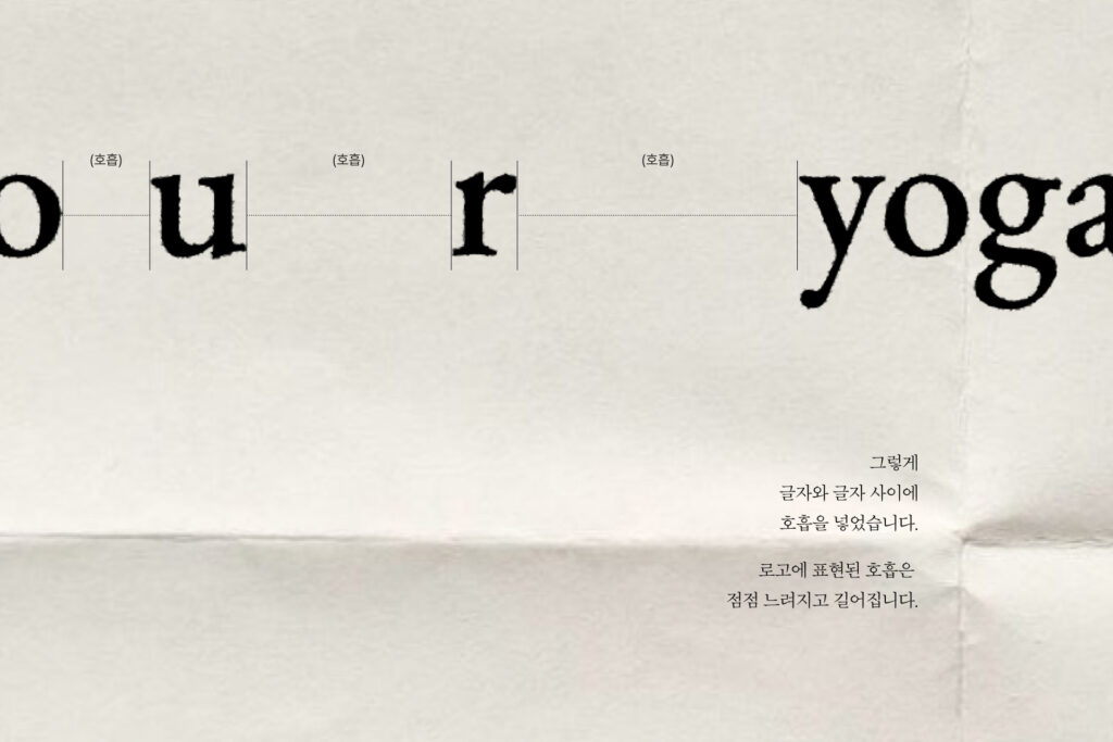
그리고 이 모든 순간에 함께하는 호흡.
그렇게 로고타입 속에 ‘호흡’을 담았습니다. 점점 느려지고 깊어지는 호흡은,
이 공간에서 경험하게 될 명상의 순간을 떠올리게 합니다.
We rebranded the yoga studio OUR, a space created for people to practice together while feeling comfort and connection.
The brand visuals are calm and minimal, designed to support focus without distraction. The logo is purely typographic, stripped of ornament, reflecting the studio’s identity and atmosphere.
At the core of this rebranding lies the idea of space between letters as the brand’s identity. Asking, “Can yoga, practice, and meditation be expressed with letters alone?”, we explored yoga’s essential qualities:
balance, focus, relaxation, meditation, flexibility, strength, energy, flow, awareness, harmony, cleansing, recovery, immersion—
and above all, breath.
Breath was embedded into the logotype itself. Slower, deeper breathing evokes the meditative moments to be experienced in this space.