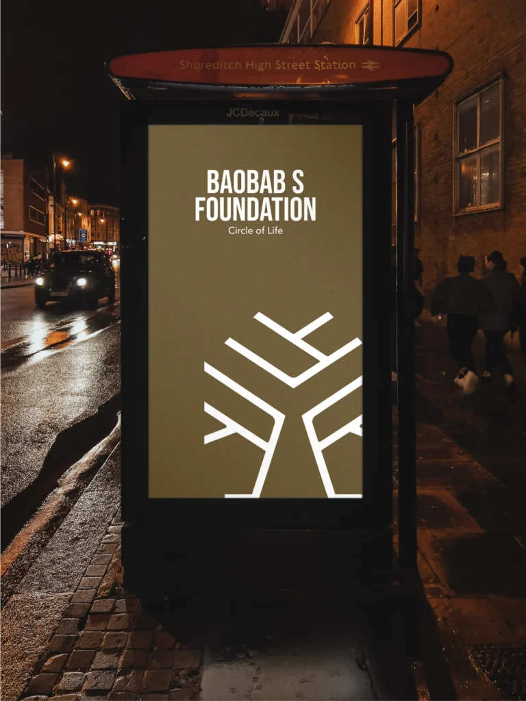
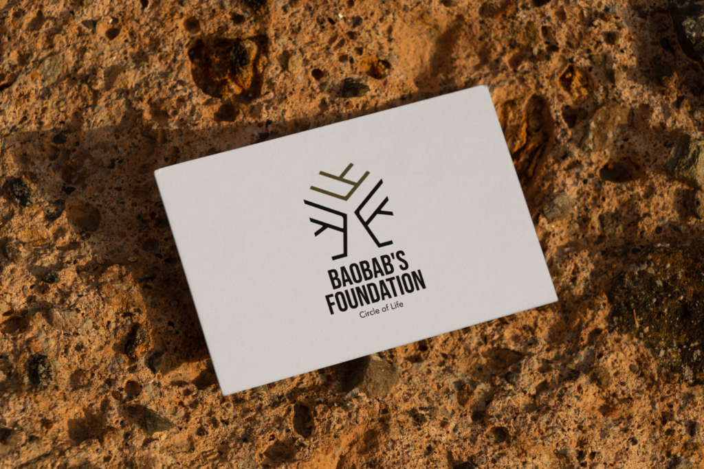
BAOBAB’S FOUNDATION
BAOBAB’S FOUNDATION
BI Design
2021
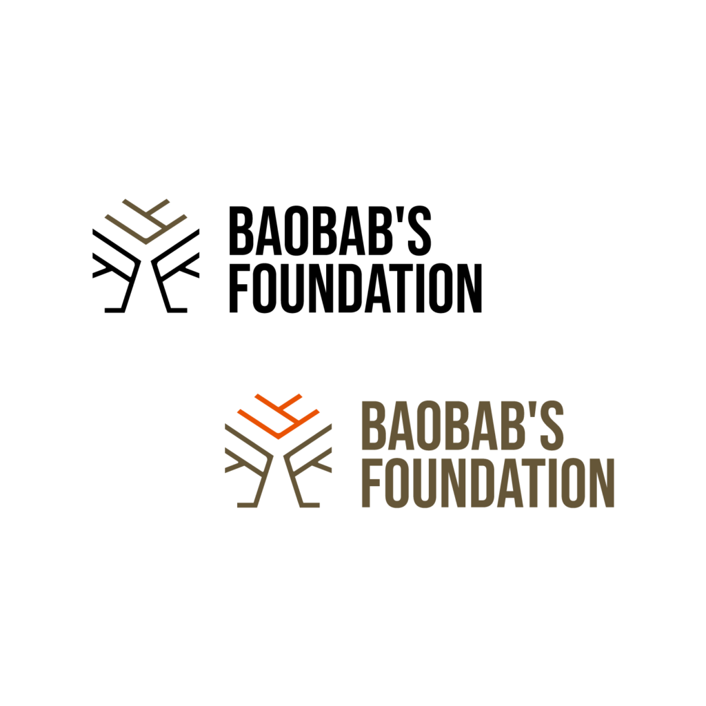
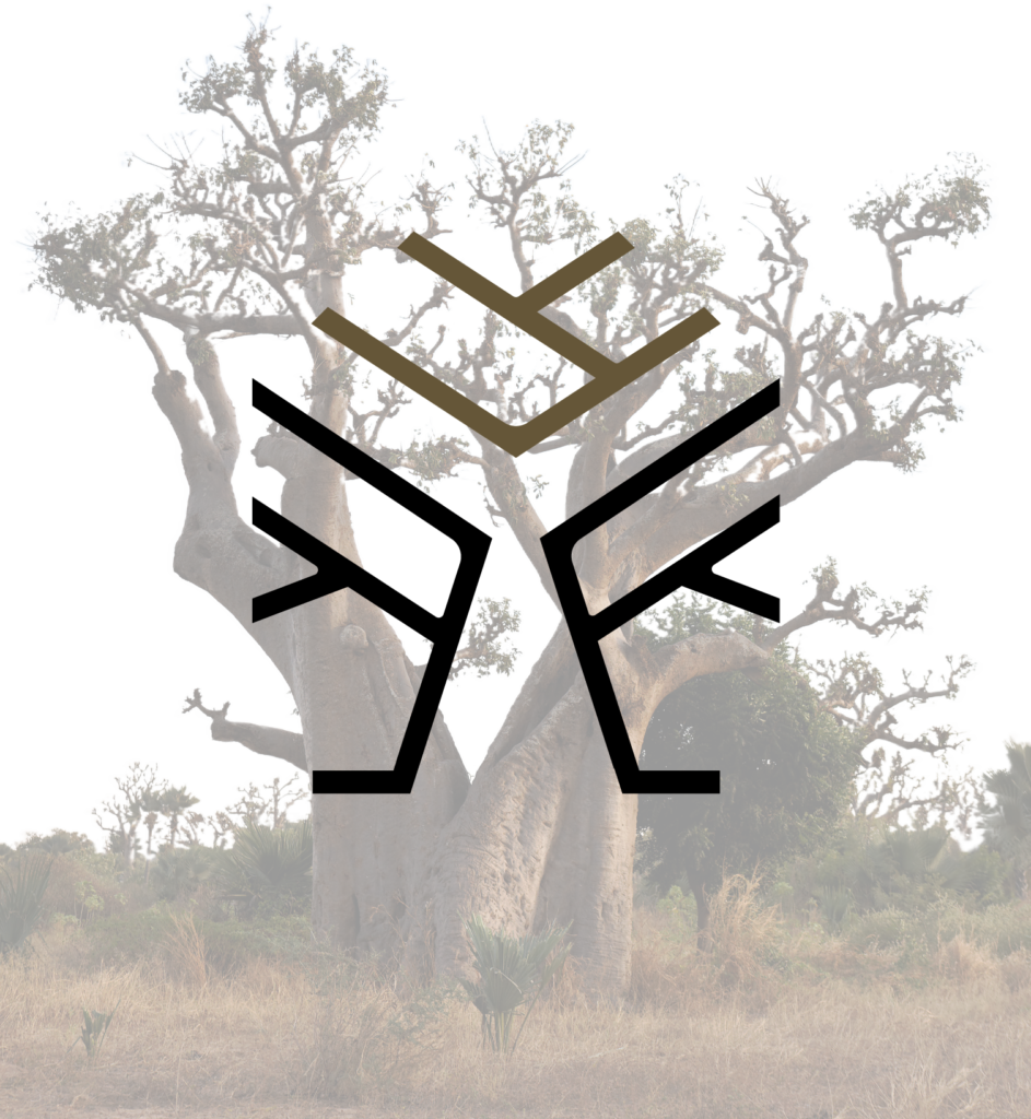
드리밍트리 파운데이션(dreaming tree foundation)이 바오밥 파운데이션(baobab’s foundation)으로 바뀌면서 로고를 새롭게 만들었습니다. 바오밥 나무의 굵고 힘찬 가지를 심볼로 표현했고 땅의 기운이 잘 느껴지는 브라운을 메인 컬러로 사용했습니다. 타입로고는 dreamin tree foundation에서 사용했던 서체를 그대로 사용해 양 브랜드의 연결성을 만들었습니다.
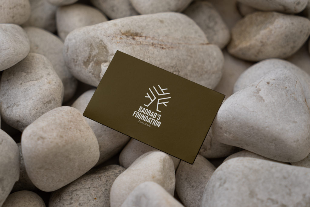
With the transition of Dreaming Tree Foundation to Baobab’s Foundation, I created a new logo. The symbol represents the strong, bold branches of a baobab tree, conveying a sense of vitality and resilience. The main color is a rich brown, evoking the grounded energy of the earth. For the logotype, I retained the same typeface used in the former Dreaming Tree Foundation logo to maintain a sense of continuity between the two brands.