Redcap
Redcap
BI Renewal
2021~2022
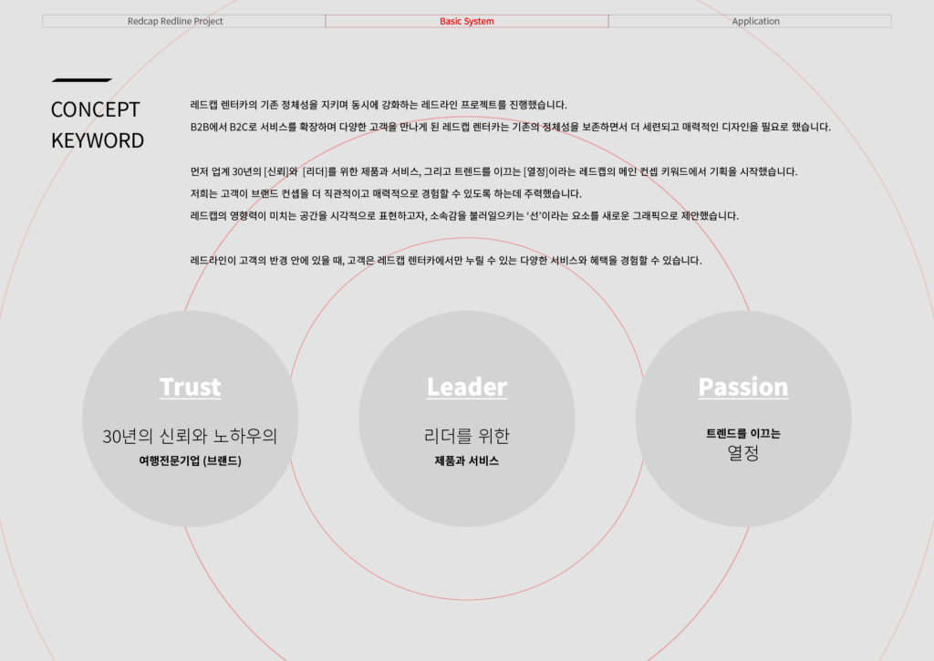
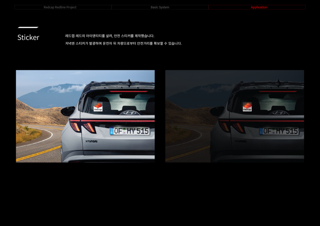
레드캡 렌터카의 기존 정체성을 지키며 동시에 강화하는 레드라인 프로젝트를 진행했습니다. B2B에서 B2C로 서비스를 확장하며 다양한 고객을 만나게 된 레드캡 렌터카는 기존의 정체성을 보존하면서 더 세련되고 매력적인 디자인을 필요로 했습니다. 먼저 업계 30년의 [신뢰]와 [리더]를 위한 제품과 서비스, 그리고 트렌드를 이끄는 [열정]이라는 레드캡의 메인 컨셉 키워드에서 기획을 시작했습니다.
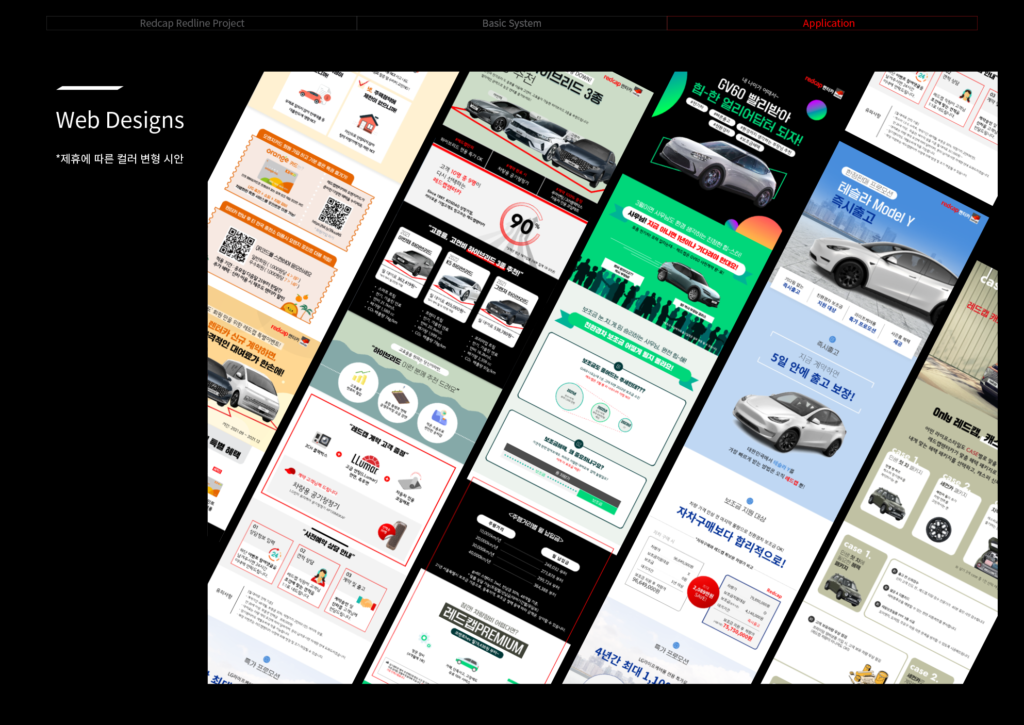
저희는 고객이 브랜드 컨셉을 더 직관적이고 매력적으로 경험할 수 있도록 하는데 주력했습니다.
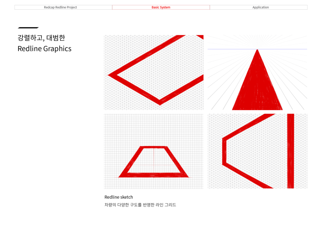
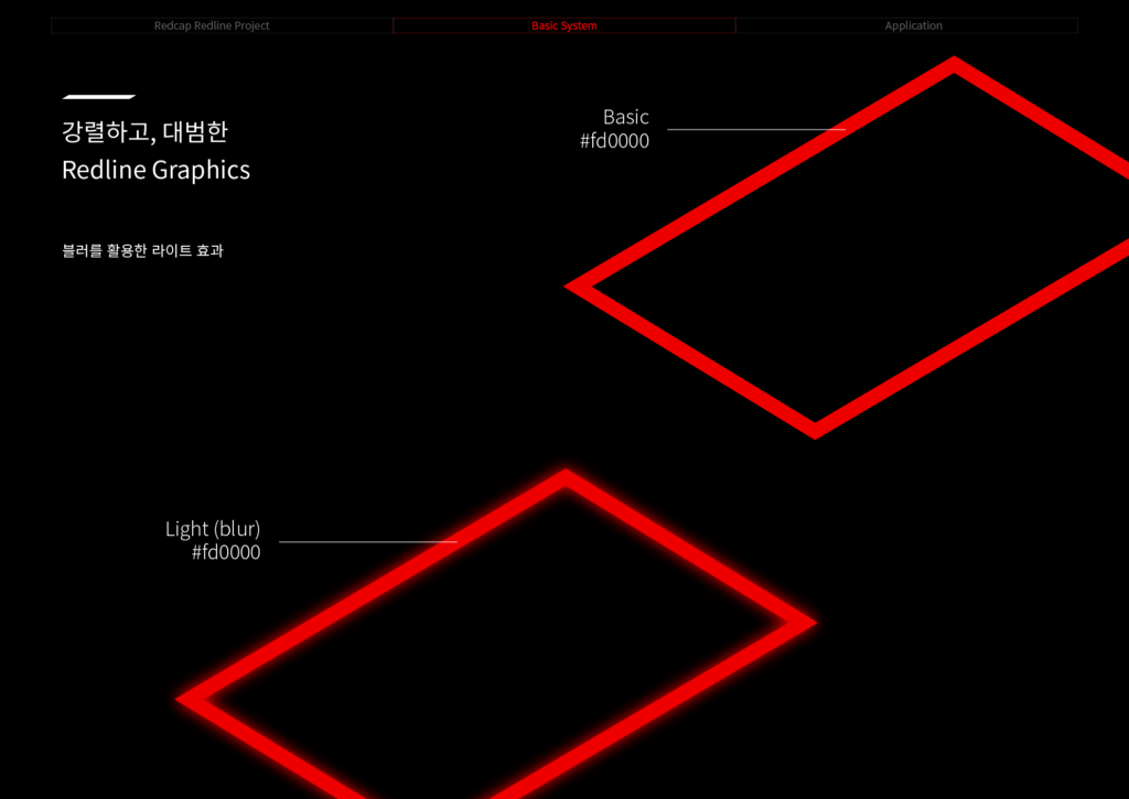
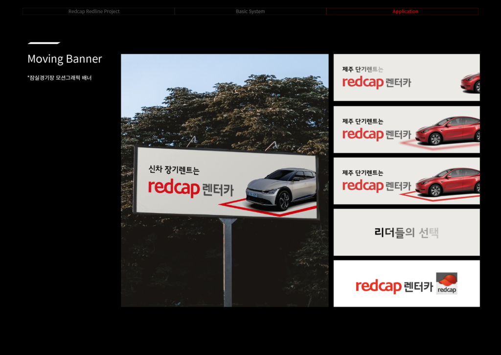
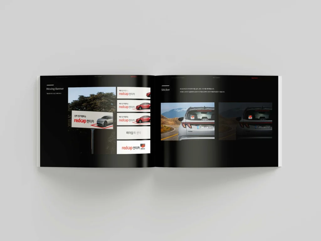
레드캡의 영향력이 미치는 공간을 시각적으로 표현하고자, 소속감을 불러일으키는 ‘선’이라는 요소를 새로운 그래픽으로 제안했습니다.
레드라인이 고객의 반경 안에 있을 때, 고객은 레드캡 렌터카에서만 누릴 수 있는 다양한 서비스와 혜택을 경험할 수 있습니다.
We carried out the Red Line Project for Redcap Rent-a-Car, with the goal of preserving and strengthening the brand’s existing identity.
As Redcap expanded its services from B2B to B2C, it became essential to retain its established image while introducing a more refined and appealing design to engage a broader customer base.
We began the project by focusing on three key brand concepts that define Redcap:
[Trust] built over 30 years in the industry,
[Leadership] through premium products and services, and [Passion] for setting trends.
Our primary goal was to ensure that customers could intuitively and compellingly experience these brand values.
To visually express the space of Redcap’s influence, we introduced a new graphic element—a «line»—that evokes a sense of belonging and connection.
When customers are within the Red Line, they gain access to a range of exclusive services and benefits available only through Redcap Rent-a-Car.